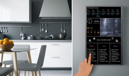
Since it’s inception, the user interface design of DAKboard has centered around two key design principles: minimalism and distance legibility.
Minimalism is conveying our message (ie. the time, or an event) as simply as possible with the fewest user interface elements as possible. And distance legibility is arranging and sizing the user interface elements such that they’re visible and legible at the appropriate distances.
While DAKboard will look great on any display, it was really designed for our 23 inch Wall Display. With this size display, we utilized distance legibility rules so that various user interface elements are visible at different distances. For example, we wanted the time and current weather to be visible from across the room, which is why they’re the largest elements. Lets break down each distance group and the elements in them.
Distance: 20+ feet / 10 meters
This distance is looking at DAKboard from another room (or from across a large room), or down the hall. The very basic features of DAKboard should be visible and legible: time and current weather, and of course the background photo:

Distance: 10 feet / 3 meters
A distance of 10 feet is standing in the same room as DAKboard. Events and the extended forecast should now be legible. In addition to the event title, the hour the event starts should also be legible. Note that at this distance, we can’t easily read the minutes or AM/PM (that comes next!).
Distance: 5 feet / 2 meters
We’ve seen the time, forecast and events from afar and now want to know a little more about the event. At 5 feet, the event minutes and AM/PM become easily visible:
Distance: 2 feet / 0.5 meters
And finally, at 2 feet we can see the smallest level of text that states the weather service being used, and the last update time:
Other Display Sizes
If you’re not using our 23 inch Wall Display, that’s ok! These rules still apply for displays of all sizes, however the distance break points will shrink or expand. For example, if you’re running DAKboard on a 10 inch tablet, the largest text now is only visible up to about 10 feet.
If you have any questions or feedback about DAKboard user interface design, please let us know in the comments below!


I am trying to hook with flickr and for some reason, all my pictures are zoomed in, I tried on my MBP and a RPi3, and its the same. How can I just show uncropped original size to fit the screen?
Hi, you may want to try changing the “Photo Layout” setting on the options page to “Fit”. This will add black borders but try to fit more of your image on the page. Hope that helps!
Hey I’m trying to get my pictures from Flickr account to show up on my DAKboard but i’m getting black screen. Could you please tell me how you have your set up. I have logged in and grant access to my flickr account but still no luck. Thank in advance!!
Hi
Any chance to get different langages available for the UI ?
French, German, Japanese, and so on … ?
Many thanks anyway, it’s a great service
Hi Pascal, thanks for the suggestion, it’s on our to-do list: https://github.com/dannyk660/dakboard/issues
This is a really cool project! The thing is, I am looking for something even more minimal (sounds like a paradox 🙂
I work from a home office with team mates all around the world and what I am looking to be able to do is to have several simple clocks (one in each timezone a teammate works in) and be able to label each of the clocks. News, weather, rss feeds etc are all cool to have too, but a multiple clock feature with custom labels would be awesome!
Any chance for such a feature request?
Nice work on the interface and integration btw!
Best regards,
Bill
Hi Bill,
Thanks, glad you like it! Currently we don’t have any plans to add multiple clocks to the service. However, I’ll add it to our feature request list on GitHub (https://github.com/dannyk660/dakboard/issues) and revisit down the road. Thanks!
Will DAKboard interface with an iPhone using iCal??
Any hope of using Dakboard as an app on my smart tv in the works?
integration with accuweather.com
add 1-2 iframe spaces for own code (security cam, own photo frame etc.)
Would be nice if you could integrate a Netatmo weather station and other web sites like netweather.tv weather radar.
Like most families each person in our clan has a calendar. I find the minimalist look of the DakBoard calendar pleasing but it sometimes has me guessing which entry belongs to which child, even though they are colour coded. This is particularly complex when factoring in birthday events and play dates.
Would it be possible to associate a nickname or perhaps initials to each of the calendars, and an option (tick box) and whether to display it. That way I could mark each of my kids calendar entries with an initial or perhaps an emoji to help differentiate them once they are incorporated into the consolidated calendar.
Hi Martyn,
You can already enter the calendar name in DAKboard today, however like you said, there’s no way to have that name show up. I’ll open a feature request on our GitHub page to have this added in: https://github.com/dannyk660/dakboard/issues. Thanks.
Hi,
Is it maybe possible to lower the rss feed so that it’s sticky to the weather? now it’s somewhat up so it’s trough my foto’s 🙂
Hi Rene, you may want to give the “Mobile/Tablet” layout a try. That puts the RSS feed at the bottom just like you’re asking!
Hey, what’s the chance of adding an Instagram hashtag option? Show Instagram photos that have a given hashtag? I’m thinking of setting up a DAKboard for my parents that will let them see photos from all the kids and grandkids. Plus the time and weather thrown in for a bonus.
Hi Dan,
That’s something we may be able to add. We’ll look into it! Thanks for the suggestion.
I have looked through the comments and don’t see folks asking for touchscreen features — like swipe left/right to change days/weeks/months/years, swipe up/down to change display modes, tap to drill, etc.. I would pay 100-200 more if the 23″ was a touchscreen and the software supported this like the conference rooms I have at work.
Is it possible to get custom layouts or layouts that can be changed by user. Non of the standard layouts is what I really want.
Thanks
Rene
Hi Rene, stay tuned … this will be announced out soon!
Custom text is a very nice feature on the custom layouts, thank you! However, the text is hard coded justified left. Will it be possible soon to justify center, or right? A scrolling feature for long text would be a very cool feature too.
ProTip: I use the text field to display our guest wifi network password so guests don’t have to keep asking us.
Hi Steve, yes we plan on adding justification options for various content blocks in the custom layout soon!
I need to access my desktop on raspian. How do I minimize Dakboard to do this. Broke my keyboard and need to repair a new bluetooth board. I don’t want to have to go buy a whole new wired keyboard just to get to command terminal. Thanks.
Hi Josh, you’ll need a keyboard to quit out of the DAKboard app. Ctrl shift q will quit out of the app. I don’t think there’s a way to minimize or quit out with just a mouse.