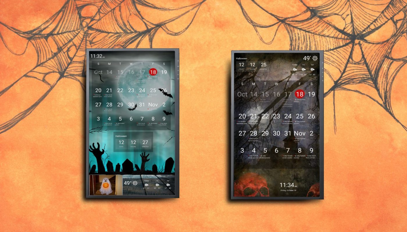
Bring movement to your DAKboard screen by using one of our custom CSS rules on your icons! This is a fun way to add some animation to your custom screens. CSS can be intimidating to the not-so-tech-savvy, which is why we want to make it as simple as possible for you. Take the following CSS below and paste it where it says ‘Add CSS Rule’ under your Styles tab at the top left-hand corner of your editor screen. Just change “BLOCK_NAME” to the name of your icon block you want to add movement to.

*NOTE: If you have multiple icons, you should rename each one with a unique title. Keep in mind, when creating your titles that this is case sensitive.
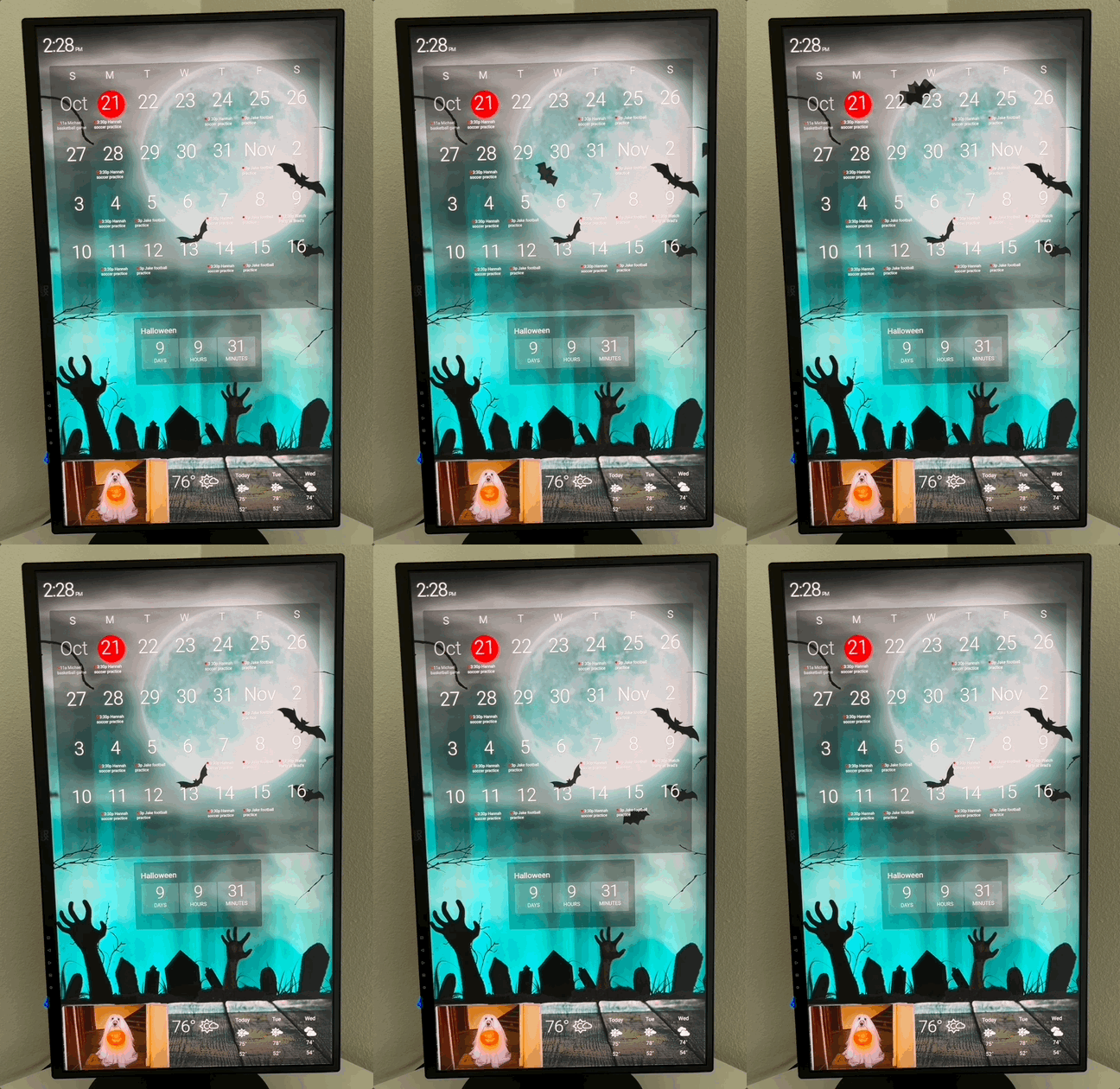
Fast Flying Bat
 .block--BLOCK_NAME {
      position: absolute !important;
      top: 43vh !important;
      left: -10vw !important;
  animation-name: movement;
  animation-iteration-count: infinite;
  animation-duration: 20s;
  }
 @keyframes movement {
          15% {
          transform: translateX(100vw) translateY(-100%) rotateZ(180deg)
      }
 15.001%, 18% {
     transform: translateX(108vw) translateY(-30%) rotateZ(0deg)
 }


 40% {
     transform: translateX(-200%) translateY(3vh) rotateZ(-180deg)
 }


 40.001%, 43% {
     transform: translateX(-200%) translateY(-100%) rotateZ(-180deg)
 }
 }
Slow Flying Bat
 .block--BLOCK_NAME {
    position: absolute !important;
    top: 12vh !important;
    left: 0 !important;
 animation-name: bat-movement-3;
    animation-iteration-count: infinite;
    animation-duration: 10s;
 }
 .block--bat2 .fa-bat {
    transform: rotate(-24deg);
 }
 @keyframes bat-movement-2{
    0% {
       transform: translateX(100%) translateY(55%)
    }
 100% {
       transform: translateX(-200%) translateY(10vh)
    }
 }
 @keyframes bat-movement-3 {
    0% {
       transform: translateX(110vw) translateY(10vh)
    }
 100% {
       transform: translateX(-200vw) translateY(-45vh)
    }
 }
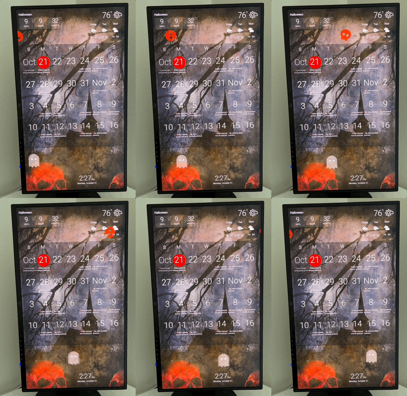
Rolling Skull
 .block--BLOCK_NAME {
     position: absolute;
     top: 10vh !important;
     left: -10vw !important;
 animation-name: rolling-left-to-right; animation-iteration-count: infinite; animation-duration: 7s; max-width: fit-content !important; max-height: fit-content !important; transform-origin: center !important;
 }
 .block--skull.block-icon {
     --block-width: 90pt !important;
     --block-width-px: 120px !important;
     --block-height: 90pt !important;
     --block-height-px: 120px !important;
 }
 @keyframes rolling-left-to-right {
    from {
       transform: translateX(0) rotate(0);
       animation-timing-function: ease-in-out;
    }
 to {
       transform: translateX(110vw) rotate(1440deg);
       animation-timing-function: ease-in-out;
    }
 }
Floating Ghost
 .block--BLOCK_NAME {
    position: absolute;
    top: 78vh !important;
    left: -5vw !important;
 animation-name: ghostly-float-left-to-right;
    animation-iteration-count: infinite;
    animation-duration: 10s;
 }
 .block--ghost > DIV {
    width: fit-content;
 }
 .block--ghost > DIV > .fa-ghost {
    width: auto;
 }
 @keyframes ghostly-float-left-to-right {
    0% {
       transform: translate(0);
       animation-timing-function: linear;
    }
 15%  {
       transform: translate(15vw, -1vh);
       animation-timing-function: linear;
    }
 30% {
       transform: translate(30vw, 2vh);
       animation-timing-function: linear;
    }
 45%  {
       transform: translate(45vw, -1vh);
       animation-timing-function: linear;
    }
 60% {
       transform: translate(60vw, 2vh);
       animation-timing-function: linear;
    }
 75%  {
       transform: translate(75vw, -1vh);
       animation-timing-function: linear;
    }
 90% {
       transform: translate(90vw, 2vh);
       animation-timing-function: linear;
    }
 100% {
       transform: translate(105vw, -1vh);
       animation-timing-function: linear;
    }
 }
Don’t be afraid of experimenting with the speed, position, direction of movement and rotation of your icons! You can do this by changing the numbers within the CSS. Share how you’re using custom CSS on your screens with us on Facebook or Instagram and tag us!
Add a Ghoulish Touch With a Halloween Background!
It’s always fun to refresh your DAKboard custom screen with a new and festive background image. We’re sharing some of our favorites on our Imgur page!
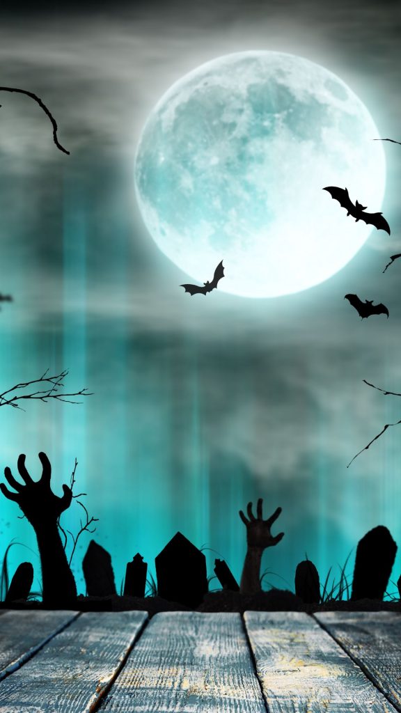
Spooky graveyard night 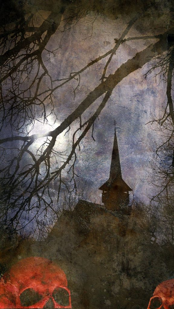
Dark haunted house
Spooky Graveyard Night and Dark Haunted House can be found on our DAKscreens Imgur page. Copy either of these image URLs and paste them into your Photo block. Remember to add .jpg to the end of the URL when saving to your DAKboard custom screen.
*NOTE: Some images may be missing. This is a known issue by Imgur who says they are working on fixing this. In the meantime, we can provide direct image URLs to any previous photos you would like. Just send us a message!
Don’t forget to check out our templates, too!
Thanks!
We hope you find this functionality in DAKboard useful. As always, feel free to comment below, or contact us through our support site with any questions or feedback.
Follow us on Facebook, Instagram and YouTube to be among the first to learn about new integrations, tutorials, tips and inspiration.

