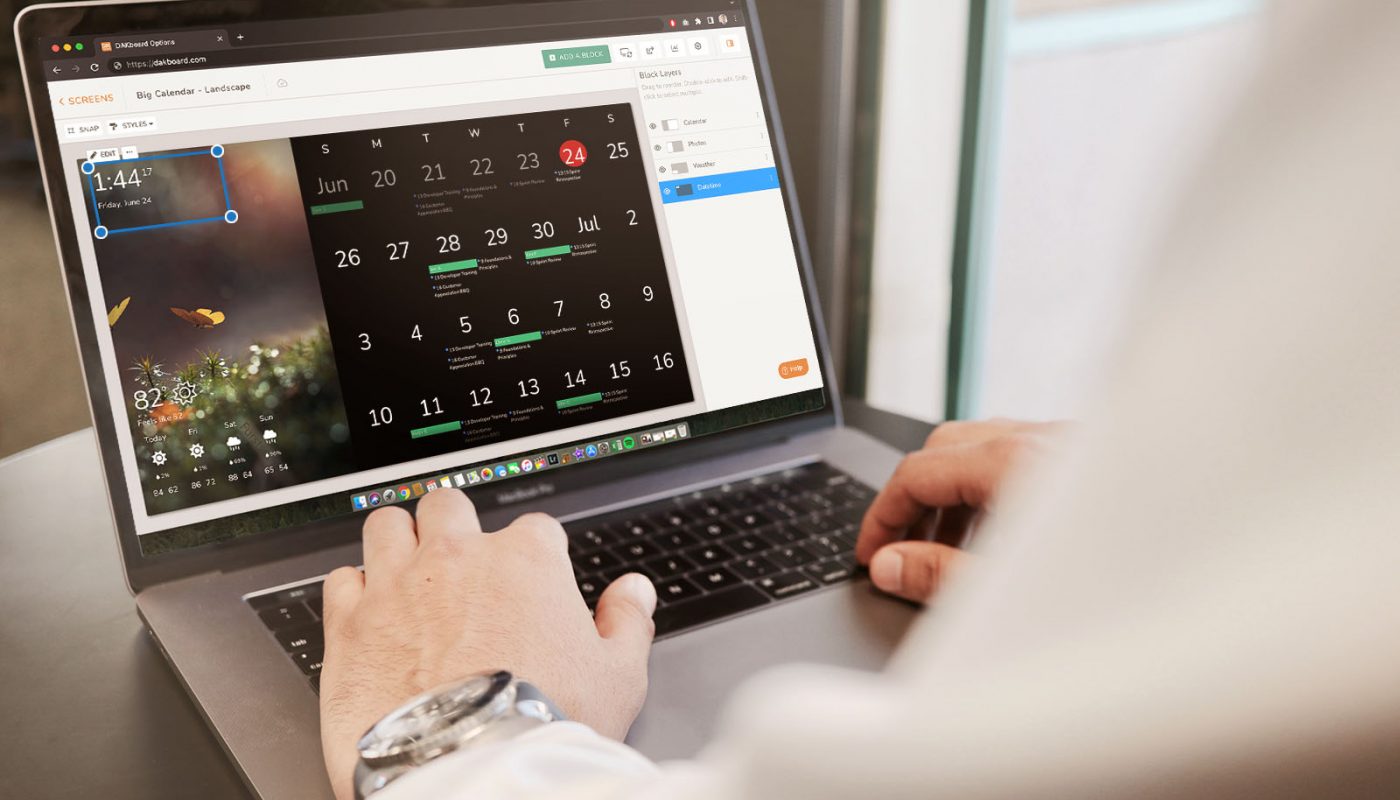
We are extremely pleased to bring the ability to edit screen layouts with live content! This enhancement removes any guess-work, showing you exactly how a Custom Screen will appear when displayed on the configured device. No more flipping between the preview and editor windows to align blocks or see how the content will flow when viewed!
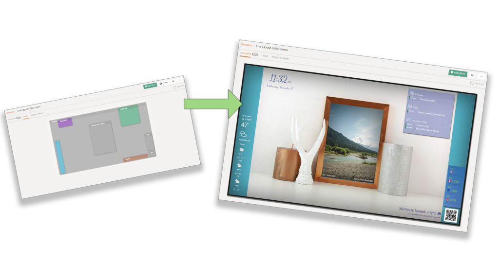
The new editor is proportionately scaled according to the resolution dimensions configured under the Settings & Defaults tab for the Custom Screen, so that the layout may be viewed in any browser on any device, but still see it as it would appear on the intended display device.
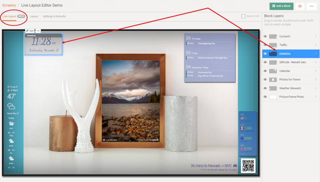
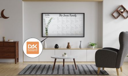
Having the ability to see the content with a high degree of accuracy for its position and size, aligning screen elements is a simple task. For example, in the sample screens depicted in this article, a photo block of a scene that contained a picture frame was used as the background, with another photo block on top of it, easily aligned and sized to fit within the frame.
For those that still wish to use the standard layout editor, that is still available in another tab on the Custom Screen configuration page. However, to get started with the new Live Layout editor, simply follow these steps:
- Login to your DAKboard account
- Navigate to “Screens“
- Add or Edit a Custom Screen
- Switch over to its “Settings & Defaults” tab
- At a minimum, review and set the “Aspect Ratio”, “Resolution”, and “Orientation” values accordingly (see sample screenshot below).
- Now, navigate back to the “Live Layout” tab (see screenshot below)
- In the upper-right corner, select “Add a Block”
- Choose a block and have fun!
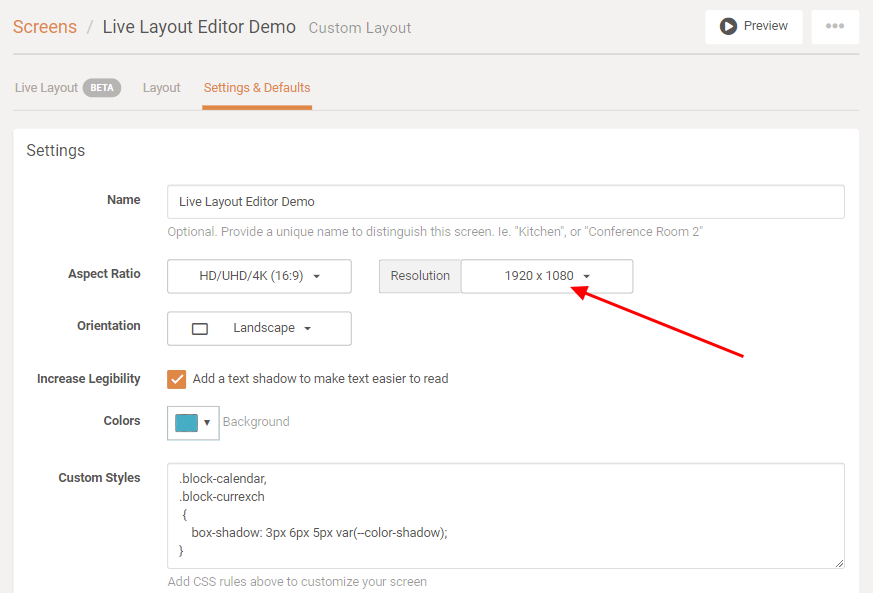
The aspect ratio, resolution, and orientation settings in this Settings & Defaults tab of a Custom Screen will adjust the scaling the Live Layout editor uses to render the appearance of the screen. These settings should represent the device which will display the Custom Screen. If there are no aspects or resolutions that match your intended device, you may always use the “Custom” selection and enter your own width and height dimensions (in pixels).
The Live Layout editor (shown below) works in the much same manner as the standard layout editor, utilizing block containers in the layout area, and the block list on the right-hand side. Initially, no block containers will be selected, but hovering over the content will highlight the blocks. Click on one to move, resize, or edit its specific settings. Convenience features such as the layout grid, the snap-to-grid toggle, and collapsing block list are all still available. The Live Layout editor even honors most Custom CSS Styling statements if you have added any!
With the ability to edit screen layouts in this manner, focus may be shifted from screen administration to a more enjoyable creative process. Let the infinite possibilities inspire you!
Thanks!
We hope you’ll enjoy these latest features. If you have any questions or feedback, we’d love to hear from you. Feel free to post a comment below or check out our support page for more information.

Dan,
This is a great feature… and it looks superb ! I can’t wait to see what you guys do next.
This is one of the best updates yet! No more ping ponging back and forth with refresh screen. Live content and updates immediately. Great work!
The “help” button was also another good feature. However, for me, it’s in the way of the “saves changes” button when I’m on the mobile app and editing/trying to save.