Just in time for the holiday season, DAKboard’s CPU v5 is now available for purchase! The benefits of the v5 over other CPUs include a faster processor, faster RAM and more graphics power. The CPU performance is 2-3x quicker than the Pi 4. Micro SD cards are read on the Pi 5 at twice the speed of the previous model.
Having a hard time choosing a CPU? Check out our Comparison Chart!
Add Falling Leaves To Your Autumn Screen With Custom CSS!

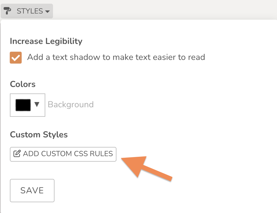
Give your DAKboard screen some animation by using custom CSS with your icons! To make it easy for you, we’ve added the codes below, broken down by the speed of each falling leaf. Take the following CSS below and paste it where it says ‘Add Custom CSS Rules’ under your Styles tab at the top left-hand corner of your editor screen. Just change your icon Block Title to the name included at the top of the code shown in bold below.

Slow-Speed Falling Leaf CSS
.block--slowleaf {
    position: absolute;
    top: 20 !important;
    left: 65 !important;
 animation-name: falling-leaf;
    animation-iteration-count: infinite;
    animation-duration: 17s;
 }
 .block--leaf > DIV {
    width: fit-content;
 }
 .block--leaf > DIV > .fa-leaf {
    width: auto;
 }
 @keyframes falling-leaf {
    0% {
       transform: translate(0, 0) scale(1.2) rotate(45deg)  rotate3d(0,0,0, 0);
       animation-timing-function: linear;
    }
 25% {
       transform: translate(-5vw, 25vh) scale(0.8) rotate(25deg) rotate3d(0.55, 0.75, 0.25, 60deg);
       animation-timing-function: linear;
    }
 40% {
       transform: translate(1vw, 35vh) scale(1.05) rotate(35deg)  rotate3d(0.45, 0.6, -0.75, 25deg);
       animation-timing-function: linear;
    }
 55% {
       transform: translate(-5vw, 55vh) scale(0.95) rotate(15deg)  rotate3d(-0.75, 1.15, 0.35, -70deg);
       animation-timing-function: linear;
    }
 100% {
       transform: translate(3vw, 105vh) scale(1.15) rotate(25deg)  rotate3d(2, 1, 0.5, 50deg);
       animation-timing-function: linear;
    }
 }
Medium-Speed Falling Leaf CSS
.block--mediumleaf {
    position: absolute;
    top: 0 !important;
    left: 0 !important;
 animation-name: falling-leaf;
    animation-iteration-count: infinite;
    animation-duration: 11s;
 }
 .block--leaf > DIV {
    width: fit-content;
 }
 .block--leaf > DIV > .fa-leaf {
    width: auto;
 }
 @keyframes falling-leaf {
    0% {
       transform: translate(0, 0) scale(1.2) rotate(45deg)  rotate3d(0,0,0, 0);
       animation-timing-function: linear;
    }
 25% {
       transform: translate(-5vw, 25vh) scale(0.8) rotate(25deg) rotate3d(0.55, 0.75, 0.25, 60deg);
       animation-timing-function: linear;
    }
 40% {
       transform: translate(1vw, 35vh) scale(1.05) rotate(35deg)  rotate3d(0.45, 0.6, -0.75, 25deg);
       animation-timing-function: linear;
    }
 55% {
       transform: translate(-5vw, 55vh) scale(0.95) rotate(15deg)  rotate3d(-0.75, 1.15, 0.35, -70deg);
       animation-timing-function: linear;
    }
 100% {
       transform: translate(3vw, 105vh) scale(1.15) rotate(25deg)  rotate3d(2, 1, 0.5, 50deg);
       animation-timing-function: linear;
    }
 }
Fast-Speed Falling Leaf CSS
.block--fastleaf {
    position: absolute;
    top: 30 !important;
    left: 92 !important;
 animation-name: falling-leaf;
    animation-iteration-count: infinite;
    animation-duration: 7s;
 }
 .block--leaf > DIV {
    width: fit-content;
 }
 .block--leaf > DIV > .fa-leaf {
    width: auto;
 }
 @keyframes falling-leaf {
    0% {
       transform: translate(0, 0) scale(1.2) rotate(45deg)  rotate3d(0,0,0, 0);
       animation-timing-function: linear;
    }
 25% {
       transform: translate(-5vw, 25vh) scale(0.8) rotate(25deg) rotate3d(0.55, 0.75, 0.25, 60deg);
       animation-timing-function: linear;
    }
 40% {
       transform: translate(1vw, 35vh) scale(1.05) rotate(35deg)  rotate3d(0.45, 0.6, -0.75, 25deg);
       animation-timing-function: linear;
    }
 55% {
       transform: translate(-5vw, 55vh) scale(0.95) rotate(15deg)  rotate3d(-0.75, 1.15, 0.35, -70deg);
       animation-timing-function: linear;
    }
 100% {
       transform: translate(3vw, 105vh) scale(1.15) rotate(25deg)  rotate3d(2, 1, 0.5, 50deg);
       animation-timing-function: linear;
    }
 }
Play around with the speed, position, direction of movement and rotation of your icons! You can do this by changing the numbers within the CSS. Share how you’re using custom CSS on your screens with us on Facebook or Instagram and tag us!
Other Recent Enhancements
- DAKboard OS 4.05 released for Raspberry Pi.
- Button Block can now be used for Loops or Screen schedules.
- Scrolling added to Weather Alert blocks for when there are multiple alerts in effect.
Thanks!
We hope you find this functionality in DAKboard useful. As always, feel free to comment below, or contact us through our support site with any questions or feedback.
Follow us on Facebook, Instagram and YouTube to be among the first to learn about new integrations, tutorials, tips and inspiration.


